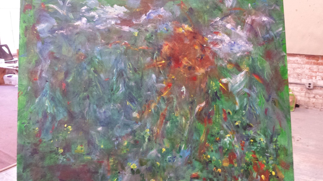
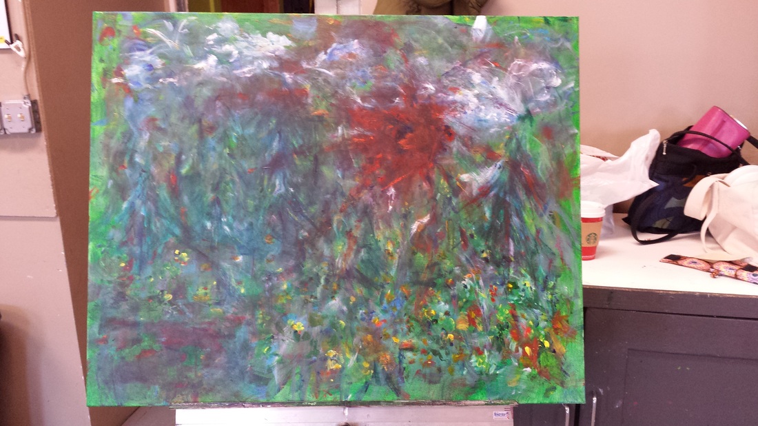
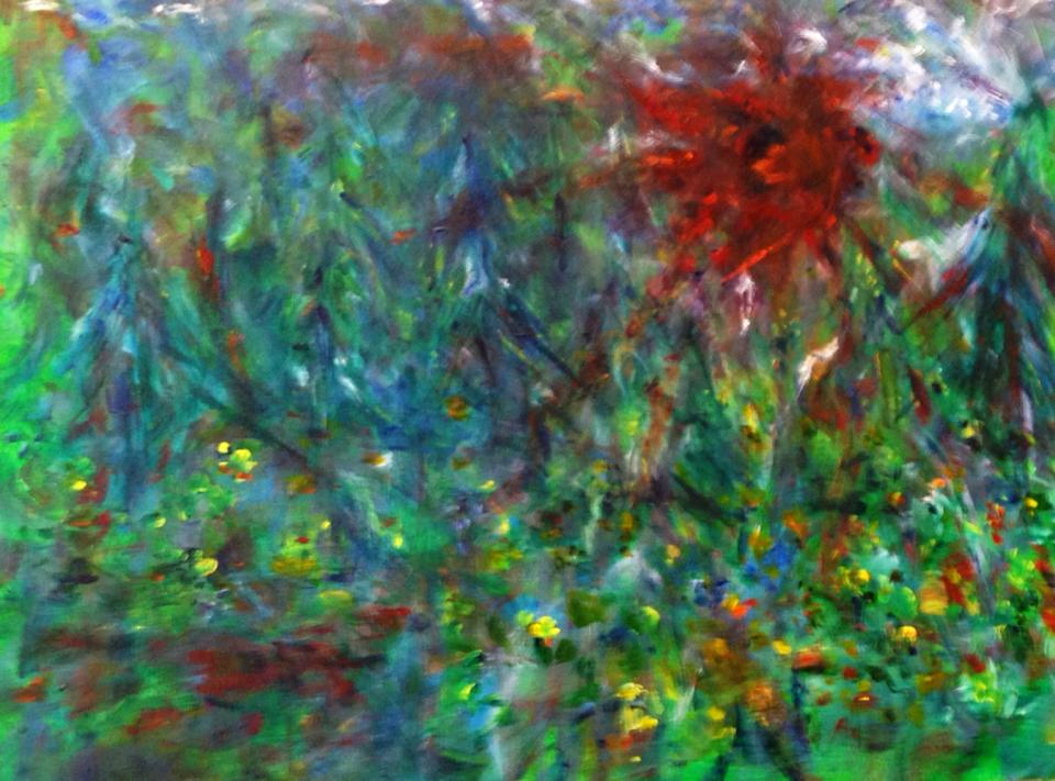
 Initial underpainting What to do? What to do? So I have this very large abstract watercolor painting started (see Part II), by pouring the background. But I had no idea where to go with it. Since Ruth's workshop was focused on abstract expressionism, what did I want to say, express, "feel" (boy, that's a hard word for me - feel!???). What to do when stuck on abstraction, drop Ruth a note. Evidently I wasn't the only one still stuck from the last workshop. She graciously offered to reconvene another workshop. As we met one-on-one trying to decide where to go with this painting, I mentioned how much I love the work of abstract landscape artist, Brian Rutenberg. He had an amazing exhibit at the Saginaw Museum of Art a few years ago. I went twice. The depth and sense of height he creates in his work is remarkable. The more you look the more you see. His book (and YouTube series), Clear Seeing Place, is so worth reading/seeing. It gives such insight into the artist process and life. So that was the direction I wanted to take - abstract landscape with lots of emotion or fireworks. As Ruth suggests, the next step is to start finding shapes. Rutenburg likes to represent trees has just vertical lines. So I tried that too, but I'm no Rutenburg. 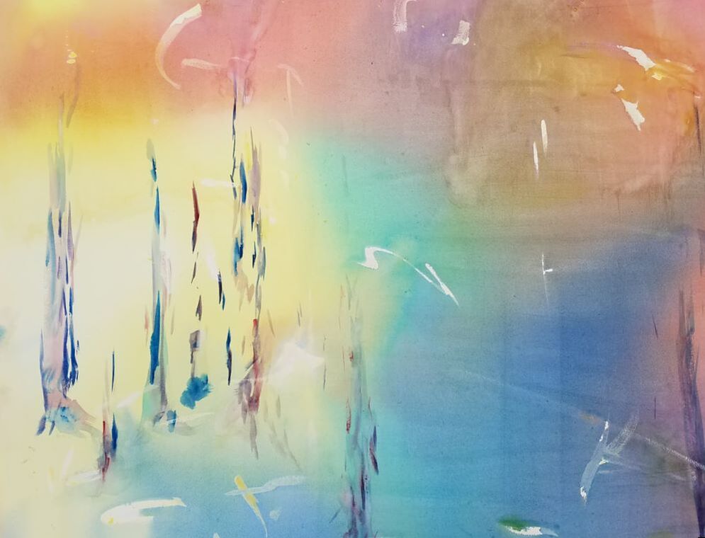 Finding shapes. With the "trees", it began looking like there was water and a sunset. How surprising - well not really as that is what I love most. And so the shape-making process continued. 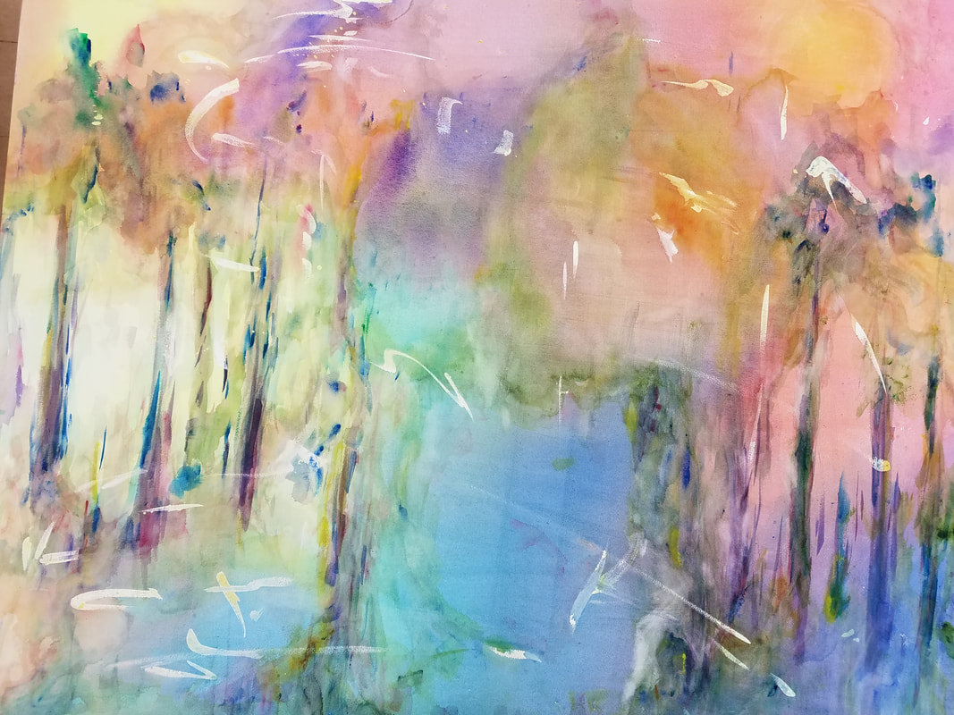 Adding more shapes and unifying left and right. Trees took shape and shadows. What about all the masked, saved whites? What the heck to do with that. The gang thought just leave them. But I decided to soften some and try to better connect both sides. Lessons Learned:
 Fireworks (Watercolor on Artboard; 32x40)
0 Comments
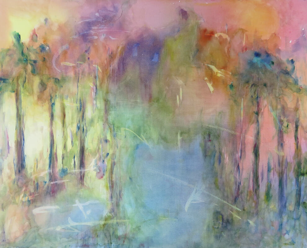
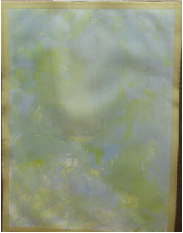
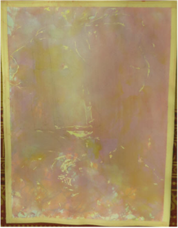
The journey into watercolor abstraction continued during Ruth Gilmore Lang's fall workshop. Unlike the previous painting (see Part 1), I wanted to pour all the colors concurrently, rather than wait between pours. In addition, Ruth encouraged me to go bigger yet. So out came a 32" x 40" aquaboard by Arches. That size is HUGE compared to my norm and comfort level! I saved (mask) some whites. Then starting with premixed paint and a wet board, I began a semi-controlled pour of the paint - trying to react "intuitively" to the color choices, but consciously to it's placement. This layer, when dried, would become the underpainting (or background) of the painting. And so the semi-terrifying and adrenaline-rush pouring, tipping, hyper-ventilating blowing began. And then...I let it rest. The underpainting was done. And so was the workshop! Yikes, I had no idea where to go next besides home. Ruth - you can't leave me hanging like this. 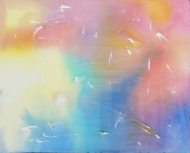 Result after first pour and masking. It's been awhile. You may have read my long post from a few years ago when I plunged into abstract painting. Afterwards, how and what to paint got lost for a bit. That struggle continues even though I've continued to paint over these past years, exploring figure and portrait drawing, gouache, impressionism, figurative and abstract painting. But in all the experimentation, my devotion to watercolor has been resolute. This fall the opportunity to return to abstract painting arose. Ruth Gilmore Langs offered two 3-day workshops at her beautiful Jumping Water studio on the Huron River. And this time, I was ready to jump into that water to push myself and watercolors. My goal was to loosen up aided by two techniques: pouring watercolor, painting BIG (for me anyway). I also wanted to explore more if watercolor would be a good medium for creating abstracts. The first painting was done on a 30x20 Arches hot press art board. The first round was to wet an area of the paper and pour a primary color. Then add the next color and the next. This step left a lot of white where the paper hadn't been pre-wetted. This wasn't my intent. But I didn't mind the result.  What a beautiful, inspiring place to paint! 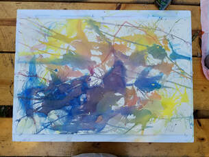 First Pour Never one to leave well enough alone, I decided to glaze in some yellow in one corner. Well then the rest of the painting looked out synch. Another round of pouring seemed needed to pull it back together. Reading more about pouring that night, I realized I should have wet the entire board before pouring. So this time I mixed up several shades of each primary, wet the board, and then tried a controlled pour so that red, blue and yellow would not mix all together and create mud. Hmm, Ruth couldn't watch after pouring the first red. But what the heck, I went for it, adding yellow and tipping and mixing, then the blues. More reds. Tip, blow, guide, pray. Let it rest. Wild, fun, creative. The inner kid turned loose. The inner Buddhist okay if it all went south. The beauty of watercolors having their own little party. And there it was - "Falling" - in love with painting and watercolor and even abstract painting. 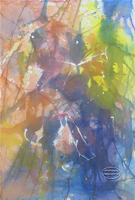 "Falling" - Final painting after second pour.
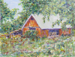
Let me get it out there up front. I love the Impressionists and the Toledo Museum of Art (TMA) in nearby Toledo, Ohio (not Spain :-)). If you haven't visited the museum, it's a treasure. We went for the first time a few years ago to visit the Glass Pavilion. It's the museum's huge exhibit of glass works as well as their "hot shop" studio, demonstration and classroom for creating glass and learning about glass.
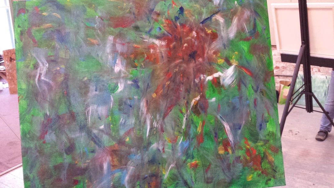
After watching an amazing glass blowing demo, we crossed the street to return to the main museum. We wandered up the marble staircase and into a gallery. We were surrounded by Impressionist, pre/post impressionist paintings. Quietly circling the room and the next and...Monet, Van Gogh, Pissarro, Degas, Renoir, Cézanne, Manet, Sisley, Morisot. I was truly in awe. This secret hideaway of the masters I'd so admired - right in front of me (though the museum guard did shadow me and politely ask me to step away from the Monet and the Renoir and...). What a day! Being I naïve Michigander, I learned that the TMA was privately endowed originally by the Libby (glass) Family in 1901. It is free to the public. What I discovered is that it's collection is amazing and world-renowned. It's main mission is art education. And so I promised myself to take a class there someday. That day came this January. On a snowy Sunday afternoon I drove the 50 minutes to begin a 6-week journey to learn to "Paint Like An Impressionist" taught by Paul Brand. The museum provided all the materials (acrylic, canvas, brushes). What was so cool was to learn the history of Impressionists, the key characteristics of their paintings. But most importantly we were invited to study the actual impressionist paintings close up. "Go ahead, get closer. See the taches (small brush marks) Monet makes in his painting Antibes Seen from La Salis". What? Get closer? Won't the guard arrest us? No, we could get as close as we wanted. And I stood there listening as my fellow students and teacher critiqued the Monet. "Why did he add the dark tree in the left corner? Should he have left it out?" What? Question a master? Sure. Then onto Pissarro's Peasants Resting. Again we approached within an eyelash of the woman's leaning elbow. "Is it left floating too much? Would you have painted the background behind the elbow in that color?" The strokes, use of color and light. What an education it was. Of course we were then left to paint our impressions of a little road in Cades Cove (Smokey Mountain National Park) - one of my favorite places in the world. Then we were challenged to take a black and white photo and create a painting using complementary colors and the impressionist style. I picked a landscape of a country barn. These little paintings took me the entire 6 weeks. I learned to use acrylics a bit. Being a watercolorist, the idea that I could use white, that I could paint over mistakes (well some anyway) was pretty freeing. But most of all I got to walk around in the impressionist shoes for six weeks. After each class, I wandered back up to that gallery and many others to quietly study, admire, be awestruck and humbled by the beauty and love, the gift these artists left for the world. Go, enjoy, learn, be awestruck! Where do you go next after taking an abstract workshop that profoundly touches you, how you approach painting, and what you actually paint? Stuck. That's what I was after my last post on the Abstract Intensive (see below). Could I simply return to painting watercolor landscapes, flowers, buildings - business as usual - after pouring out my heart onto an abstract canvas? No. I stopped painting after the workshop. Stuck. Should I drop my watercolor style and take up abstract painting? At a crossroads. Two roads diverged in a wood... And I - I asked for direction. I wrote Ruth Gilmore Langs, our abstract workshop instructor, and confessed I was at a loss for what and how to paint. Ruth's reply: "Start with what you know for sure :-)." Wise advice. But what did I know - for sure? Late that same afternoon, we were leaving a small country party store, CJ's, way out on North Territorial Road. We looked out across a frozen wheat field bordered by a row of leafless trees. And there was the most incredible sky, sunset. Stunning with its grey-blue streaks, red, orange and yellow glows silhouetting the lacy trees and grasses. And this is what I know, have known for a very long time: - I LOVE nature! - There is beauty all around ready to surprise, in the little rocks on the shore, the wind in the trees and the rising and setting of the sun. - Nature fills my heart, feeds my soul - when I look and when I listen - "my eyes of eyes open, my ears of ears awake". - I LOVE watercolors. - I may never be an abstract artist (but I'm not giving up just yet). - I will look to, listen to my heart when deciding what and how to paint. The workshop unforgettably instilled, reinforced this. So this weekend I picked up the brushes and watercolors again. Here is what my unstuck heart knows for sure: 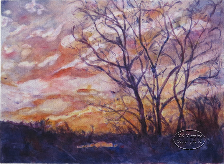 Winter Sunset -- Watercolor 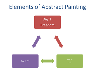 Day 1 - Freedom Day 1 - Freedom Last week I was fortunate to take an amazing art workshop. I'm not sure I'll be able to fully capture the experience, the impact, but I'd like to try. The Ann Arbor Art Center offered a "4-day abstract painting intensive" taught by abstract artist Ruth Gilmore Langs. The class met for 2 1/2 hours on four consecutive days to get an introduction into abstract painting using acrylics. The idea - bring one fairly large canvas (minimum size 20" x 20") and work on creating an abstract painting. I paint in watercolor and I usually work on a smaller scale. My work tends to be more realistic or impressionistic. It often leans toward trying to express the beauty and peace found in nature. But I've wanted to loosen up my style more and find abstracts interesting. I have no formal understanding of how to go about painting an abstract work. I love to learn. So this looked like a great class to take. Sign me up for this intellectual and creative pursuit! Eighteen women artists of varying experience showed up for the class. Pretty large group and just a bit intimidating (did I say "a bit"). Ruth seemed unphased and assured us there would be plenty enough space and one-on-one time for each of us. And we began. Day 1 - - How to begin? Freedom. Ruth wrote "freedom" on the board. She then asked: What is art? - Your reaction to the world. - Your unique view of what makes you - you. We discussed fear; facing a blank canvas. Then we talked about freedom of expression. - Be a kindergartener, a preschooler. Paint like a child. - Forget the rules. No rules. Be free. - Well there was one rule: Don't use little brushes or paint detail. If you must paint detail, paint it the size of a postage stamp to get it out of your system. Then go back to the big brushes, big strokes. - Just paint - express yourself without judgment. - Only you know what you are thinking or feeling as you put paint to the canvas. - Explore color and movement. Then Ruth offered how to start (don't quote me though) - Pause and meditate for a few moments. - What is your color for today? What is your soul color? - Cover your canvas in that color. - Then pick other colors and add them to the painting. - Interact with your canvas as you put down a color, a stroke: How does it look? How do you respond? - It's you and your canvas - a team - back and forth. - Play. Be free. Set aside judgments. Set aside fear. - Go! And so I began. - Meditate? Yes, I can do that. I try to practice mindfulness meditation. Meditating is a great suggestion especially since I'm feeling a bit overwhelmed standing before this large empty white canvas, feeling quite exposed. - Soul color? Say what? Don't panic, don't judge. Soul color - cool idea. Closing my eyes, I tried to take those three deep breaths. Chatter - people are already starting to paint. Just breathe, just breathe, just breathe. Bam! And there it was in my mind - green! "leaping greenly spirit of trees..." a line from e. e. cummings' poem, "i thank you god for most this amazing day... "* His love poem to nature, to being present, to gratitude. It's been a favorite of mine since college. Start with green. How do these acrylics work? How do you blend the various greens that came in this cheap little set of paints? How do my brushes work (old house painting brushes of various sizes that Ruth suggested bringing)? How freeing it was not to worry about "saving the precious whites" - as you do with watercolor. Using white paint is allowed - how radical! And I painted as a child - slapping on green paint, no rules, no careful wash. I filled the canvas and even painted the sides. Green, green (verde, verde, que te quiero verde!**). And stepped back to let the vibrant grass-green dry. Now what? Stall - clean my water, visit. One person noticed my canvas (most folks had their painting turned to face the wall but my location didn't quite allow me to hide as much as I'd have liked). "Green" she said. "What does green represent? Ah, the color of greed." Surprised (I guess it IS an abstract already subject to personal interpretation), I said softly, "i was thinking more of healing, of nature." Clearly, the kindergartener had more work to do. Add those "leaping greenly spirit of trees". And the "blue true dream of sky" and "the sun's birthday" and "wings". The kid in me began rapidly painting the spirit of primitive pine trees with blues and greens. Then Ruth walked by and reminded us to take our time as we added paint to the canvas; to respond to the stroke and the color as it lands on the canvas. Interact with the canvas. Ah, yes, take a breath, slow down, enjoy - look - paint - have fun. And so hints of wispy clouds began to appear in the green sky, a couple white curvy "v's" for wings. And then the sun. Big red, round swipes of the brush and a bit more red in other places to tie the painting together. Good to add red - the complement of green. Oh-oh! Those rules started creeping in. Blue - add more blue - dark blue to the sun and below the trees. And now step back. Wild, fun, a bit frenetic. Time to clean up, go home, wonder what tomorrow would bring. 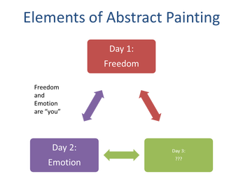 Day 2 - Emotion! Day 2 - Emotion! Day 2 - - Emotion. The word "Emotion" joined freedom on the board. Ruth now asked: What is abstract painting? - An abstract painting eliminates recognizable forms, we learned. - It is all based emotion. The painting is more physical, expressive. - Abstracts are painted with feelings, emotions unlike traditional landscapes and still lifes. She showed us examples of works by Joan Mitchell and Hans Hoffman. - We discussed how the paintings convey a feeling and meaning that is subject to the interpretation of the viewer. - An abstract does not rely on objects as do landscapes for example. - Abstracts rely on using and evoking emotion. Ruth asked us to continue working on our painting - adding a new layer: - Go back to your canvas and meditate once again. - What is today's soul color? - What emotion(s) are you feeling? If you are feeling more than one emotion, pick one of them. - Paint that. I stood before my rather chaotic canvas. Please know that I'm a private person, not big on expressing my feelings publicly (or privately or at all). That being said, I wanted to differ with her point about landscapes being painted without feeling. I do try to convey feelings, mood, message in my paintings. Perhaps I was being defensive. So I said nothing and tried to go with the spirit of the lesson. Meditate. And what did I notice? A massive headache (I was coming off a prednisone trial - one crazy-making drug), sadness, anxiousness about the state of my painting, excitement about working more on the happiness and hope in the poem. Which emotion should I paint? It would be easiest to go with the upbeat feelings. But EMOTION - big EMOTION. Gulp - okay, dare I let the sadness and pain in? The painting is kind of a mess anyhow, what do I have to lose (so much for non-judgment)? And the poem does have two sides to it. Cummings utters "i who have died am alive again today". So, be brave. Don't avoid. Notice. After all isn't that what mindfulness is all about? Remember what Ruth said: no one knows what you are thinking. It's you and the canvas. A personal conversation. I stared at my painting for a very long time as the activity around me began to swirl. I sipped my chai tea trying to calm myself. How to express this? I reached for my water bottle and sprayed the blue-green sky and the red sun and the tops of the greenly spirit of trees. And they began to weep, gray tears running down the canvas and falling to the floor. Paint sobs dripping everywhere as I watched. And then I cried. "i who have died, we who have died". Shared tears were running down my cheeks. Picking up the painting I tipped it right, then to the left; the tears flowing across the landscape and back again. I wiped the tears and blotted them and added deep blue to the running streaks and to the trees and to the fading sun and to the blurred wispy white clouds. I covered the soaring wings until just hints of them appeared. I added darkness, sadness until my heart could say no more except: stop; notice, breathe. Ruth walked up to see how it was going. "It's been a day." I'd told her the day before about the poem and had brought her a copy. And I explained that I'd painted the other side of the poem: deep sadness. But now I needed to go to my "happy place". So I returned to the "gay great happening illimitably earth" and began filling the lower, still green area with hints of flowers - bright yellows, oranges, reds, blues (happy blues), bits of white. Three-thirty - time to taking my splitting head, my exhausted self out of there. I couldn't even imagine what day 3's word would be and if I could endure.
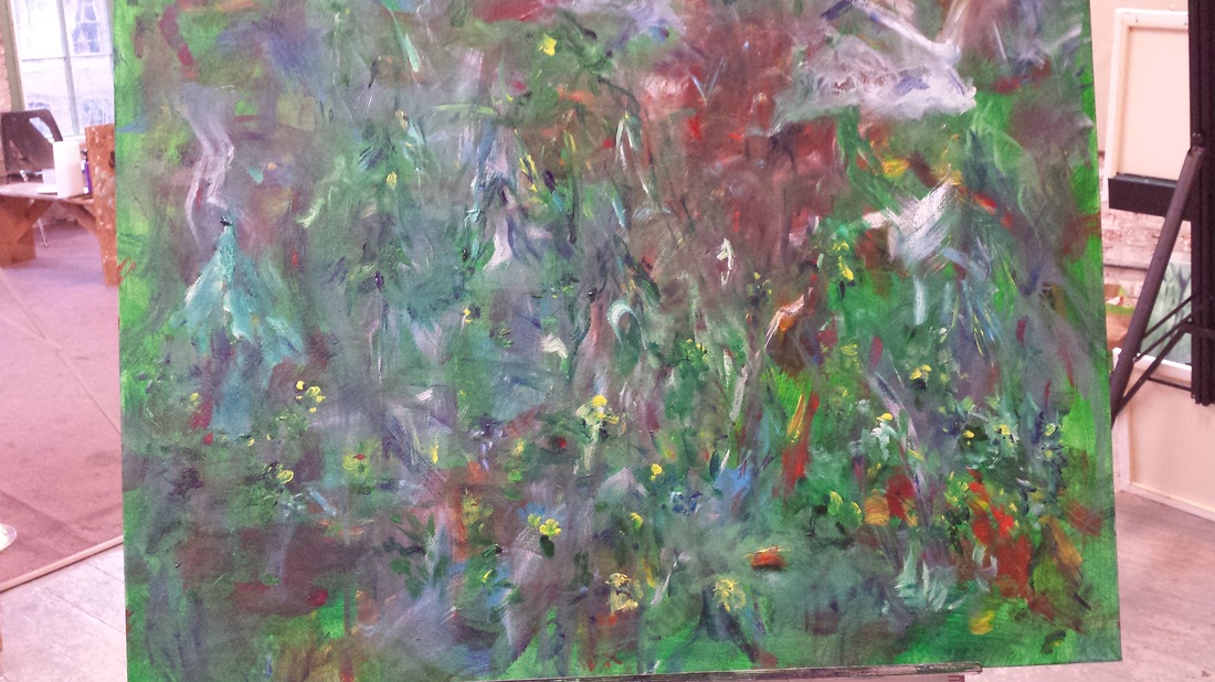
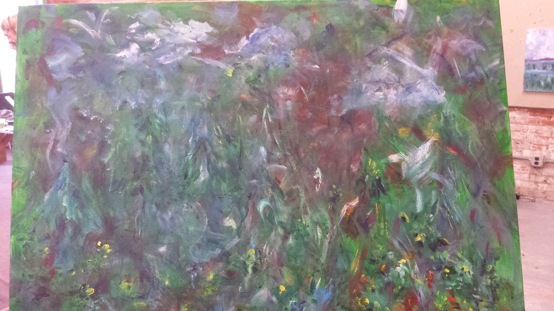
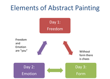 Day 3 - Form Day 3 - Form Day 3 - - Form. Day 3 continued the discussion about what is abstract art. - Abstracts are flat surfaces that show the "interior of the subject" (Mondrian). While non-abstract landscapes and still life paintings tend to have a 3-dimensional feel and/or show perspective. - Without form there is chaos. - Form can be thought of as the shapes and focal point in your painting. It is one aspect of the broader composition. What Next? - Go back to your painting and find your big shapes. - Add some if there are none. - Expand or highlight them if they are not apparent. Looking at my painting, I had achieved chaos for sure. How could I add form? Ruth helped me find some shapes and suggested adding more flowers (yeah), expanding the clouds, the blue tree "forest", and the dark reddish puddle; to leave the bright greens on the right side that survived yesterday's shower. So I spent the day playing with form as best I could. But there was so much self-judgment and self-comparison: what a mess, what a crime scene; so many really beautiful paintings by the rest of the class and some doing 2 or 3 paintings. I'm still working on the same canvas; the same canvas, the only canvas I have. But there's nothing to lose, lots to learn about layering, accepting, pushing, interacting with that canvas and the emotions that are bubbling. And in the mindfulness world isn't all that internal noise just a bunch of thoughts, not facts? Just notice, breathe, keep painting. Look for the forms: Highlight the clouds. Find the lost trees. Accent the red "lake". Add some more flowers. Keep going. Pop the sun out - add those rays. Then call it a day.
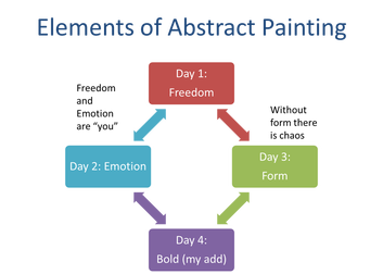 Day 4 - Bold Day 4 - Bold Day 4 -- Bold Ruth's "elements of abstract painting" drawing formed a triangle - three concepts: freedom, emotion, form. What could day 4 be about? Ruth's word of the day: Continue. - Work on form. - Then we'll reconvene and have a "gallery walk" at the end. There was so much to think about after the first three days. - Overwhelming emotion. - Child-like freedom. - Elusive form. - Comparing the experience of abstract painting to how I typically work. Still discouraged and surprised by my painting, what did I need to bring to this last day? My personal word of the day would be: Bold. - Be bold! - Bring the sun back to life while taming those rays! - See the trees for the forest (really)! And really what it came down to was to be bold in staying the course, staying with myself and, yes, changing the sun so it was bursting yet more abstract. And those flowers - those flowers that reminded me that emotions may be deeply felt and that they also change. Highs to lows and in between. How great it is to stop often, see, hear, touch, breathe and be "lifted from the know of all nothing." I'd not only painted the poem, I'd just lived it. And oh, what did I now think about the troubling idea that my past work or the work of wonderful landscape and still life artists hadn't been painted with feeling? I talked with Ruth about it at the end. My revised view: landscapes do try to convey feeling often with the aid of "objects" or a recognizable scene. But while painting this abstract, there were no photographs to reference or replicate. I was painting from inside out. I wasn't trying to convey an emotion. I was embracing it, immersed in it and perhaps transformed just a bit by it. i thank you god for most this amazing day...
References: The Transformation Summary (Days 2-4)
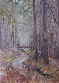
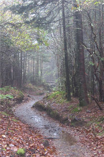
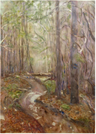
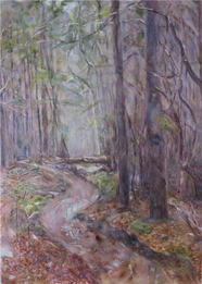
In the last post, "Pouring Watercolor...", I promised to retry the Andrews Bald Trail 1 painting by creating a color study (a smaller version than the original that plays with new color choices). The result is Andrews Bald Trail II (color study).
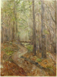
What Changed? Underpainting Wet-in-Wet vs. Pouring: When working on the color study this time, I opted not to pour watercolor for the underpainting, but instead painted it using wet-in-wet (applying fairly wet paint colors to wet paper). This allowed for a bit more control of the colors. Colors: I also limited my color palette a bit more than in the original painting. And instead of using Cobalt Blue, I switched to Ultramarine Blue (green shade) after reading an article in the most recent issue of Watercolor Magazine, "Getting to Know Blue" by Hazel Soan. For reds, only Alizarin Crimson; yellows: Aureolin Yellow and Winsor Lemon Yellow; greens: sap green, viridian mixed with either the yellows, blue or red. Foreground: Finally, with Pandora playing the Mozart station, I opted to use a much looser style and paint most of the foreground using the wet-in-wet approach. So the appearance of the retry is looser, softer edges, more impressionistic than realistic. Conclusions It was good advice to do a color study and retry the painting. It's also much more freeing for me to paint a bit looser, quicker (oh - and smaller). While I'm not sure the retry captures quite the feeling of the original photograph or my desire to create that peaceful, misty, mystical mood, it does have its own, "happy" feeling (ah, those primary colors do wonders). And...drum roll...I may try it once again...bigger. To pour or not to pour? I want to try it again, but probably not for this painting - it's cold out on the deck now! As always, it would be great to hear your thoughts. Happy Thanksgiving! Not all paintings are successes. I recently painted a small watercolor (see 'Stand Tall' in the gallery) using a new technique for me - pouring watercolor - to create a background or underpainting for the work. For a first attempt, it came out pretty well and was even accepted in to a juried show. Fired up by this experience, I was anxious to try painting bigger and experiment more with pouring watercolors. Since several folks asked how Stand Tall was painted, I thought it would be interesting to photograph the progress of the new painting. While the outcome of the new piece didn't quite capture the feeling, mood or look desired, it was a fun process. As my teacher, Nancy Solo, has said not all paintings are masterpieces. And you can always try again. So follow my process, check out lessons learned, and let me know what you think.
Step 1 - Used structured painting approach (tips from artist Michael Konas) to plan the painting: Intention/Mood: Peaceful, quiet, mystical Focus/Design: Path weaving through the forest, mist/fog, light area by fallen log, tall, straight trees in the foreground Color Palette: Pine greens, oranges/yellows/browns of the fallen leaves and trees Underpainting: Aurolean Yellow, Quinacridone Red, Cobalt Blue Foreground Colors: Same as above, plus Burnt Umber, Burnt Siena, Alizarin Crimson, Lemon Yellow, Winsor Blue, Viridian, Winsor Green Step 2 - Drew the picture on Arches full sheet, 140 lb cold press paper (22 x 30). Then masked the areas to preserve the white (puddles, top of log, bits of sky, tips of leaves). Step 3 - Taped the paper edges to contain some of the paint during the upcoming pour. Step 4 - Poured the first layer: Yellow. I mixed my yellow in a small jar then put it on a plate. Working on the outside deck because of the potential mess, I first wet the paper in the areas where I wanted yellow, greens and oranges and then poured the yellow (upper left, upper middle, lower bottom). I picked up the paper to let the paint run and move in the desired areas. Then poured the excess paint back onto the plate. Despite the windy day, I left it outside to let the first layer dry. Step 5 - Poured layer 2: Blue. Same process as above. This time I poured the blue in the upper areas where I wanted sky and also greens (yellow and blue make green when using transparent watercolor). I also poured blue in the forest sections to help create the "dark" moody feeling that was coming later.
Step 6 - Poured layer 3: Red. In the original photograph, the forest background seemed to have some red particularly on the right side. By pouring red over some of the blue to create violet, the impression of forest shadows might be achieved. Finally by combining the red with the yellow where the leaves appeared, I hoped to get a "glowing" underpainting for that section. Pouring Lessons Learned: Yikes - it's very hard to do a pour on such large paper. It runs and streaks and does what it wants. It's even more challenging to do it on a windy day. But it was a very good idea to do this outside. The paint does get all over including the backside of the paper. I battled taming the red for the remainder of the painting. I should have used the red more sparingly in the underpainting. Step 7 - Next up - paint the foreground - the forest, the leaves, rocks, logs and path. Try to capture the mist, the depth and feeling. But as noted earlier the pepto bismol red kept showing through. As I tried to neutralize it with viridian is just deepened. Adding blue to get more of a purple feel wasn't all that successful either. The painting seemed to become divided between the middle yellow light area and the reds of the forest. I kept pushing the painting to get a cohesive feel. I also worked to darken the foreground trees and soften the trees in the background. I removed the masking to reveal the whites and then softened those edges and worked on the path's puddles. But it just wasn't conveying the soft, misty feeling I was searching for. Figuring I had nothing left to lose, I tried glazing the forest with a light blue wash to unite it with the center area. But too many layers and colors - the dreaded mud, loss of translucency. Glazing also lost some of the saved whites, some of which I tried to recover using a scrubber and the handy Mr. Clean magic eraser.
More Lessons Learned: Do a preliminary color sketch (thanks, Nancy). Limit the color palette and focus more on blues and greens in the forest to create the misty, peaceful feeling. Play more with how to achieve the mist. Keepers: I liked some of the path and log, trees.
Conclusions - It was a fun painting to attempt with a mix of ups and downs, challenges and thrills. Learned lots. Much like life, isn't it? But unlike much of life, there are do-overs. So yes, Nancy, I will try this painting, again. |
AuthorMary Murphy Archives
March 2019
Categories
All
|


 RSS Feed